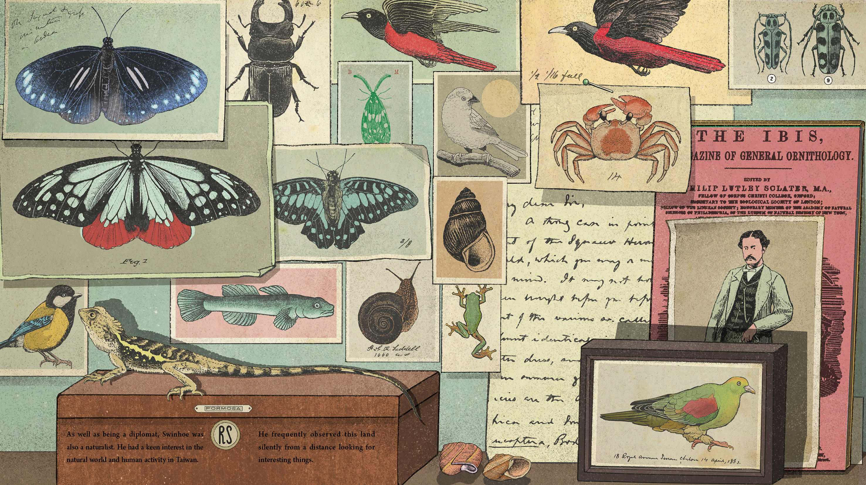
Everyone reads comic books. Even if you stopped reading them after reaching adulthood you’ll have to admit, pretty much anyone who grew up in Taiwan has their personal history of comic book fandom. Which makes one wonder: how much of our attitude towards life, our personal style and tastes, even our core values, do we owe to the influence of the comic books we read growing up? It wouldn’t be going too far to suggest, at least for some of us, that comic book were some of the major influences on our spiritual and moral development.
LGBTQ comics have a long history in Taiwan. Sub-genres for gay oriented fan-comics, boys love, otokonoko, and gender transformations have tended towards the bottom of the leader boards on comic book websites, but they have always maintained a dedicated following, and the fans of these sub-genres represent a sizeable subculture. The sinuous lines of nude forms and heightened aesthetics of attraction in these comics helped create a common vision of imaginary desire for the gay community. You could even argue that LGBTQ comics are bolder, more radical, and more open than most other expressions of LGBTQ culture, including literature and film.
Rainbow Apartment is a collection of six stories by young Taiwanese comic book artists. The stories are spatially structured around an apartment building, the sort of seven-story building we see all over Taipei, perhaps showing its age a bit, located in Yonghe or on Shida Road or some other convenient location where the rents are a bit cheaper and where young workers tend to congregate. Populating this easily imagined space with LGBTQ content brings out a vivid and fresh perspective on the daily lives in the LGBTQ community. Set in 2024, five years after Taiwan’s legalization of same-sex marriage, the stories envision a world in a which space has been made for those with nonconforming gender identities and sexual orientations – whether in the city itself, online, in a coffee shop, or on a cell phone that enables connection to a virtual world. The world of 2024 appears ready to embrace all the colors of the spectrum. The struggles and glory of the past are now history, and a new era is about to unfold.
“Apartment of the Future”, the ground floor of the collection, is the time machine that transports us to 2024, and deposits us in front of the Rainbow Apartments. On the surface, the world doesn’t appear much different, but a new story is about to begin. As we follow the stairs upward, like an invisible visitor from the past, we steal glimpses of six floors of human life.
“Colorful”, on the second floor, uses a soft multi-hued palette to tell the typical “boy meets boy” story: a muscular young man is working as a nude model for drawing classes at an art institute when he catches the eye of the institute’s director. But first they must navigate a tiny barrier that stands between them – the HIV virus. In the world of the 2020s, however, HIV is not the end of love and sex for the infected. Graced by the sensuous lines of the male body, this seductive HIV love story ultimately comes through with a clean bill of health.
After feasting our eyes on the male form on the second floor, we make our way to the third floor, “If You Are…”. The visual style of this comic adaptation of the Hikaru Lee short story “One Hundred Years, One Hundred Meetings” leaves visual space for the text passages to do their work. Having never had a lover, young, single urbanite Wen is feeling like an old maid before her time. We see her swiping away on a dating app in nearly every corner of her slightly messy apartment, hoping to find simple love in the simplest way possible. While many of us are accustomed to thinking of Taipei as a city with no particular aesthetic appeal, as we follow Wen’s searching gaze on her movements through the city, the beauty of urban life takes shape. While the source material deals with the love between two women, one living, one deceased, this adaptation interprets the barrier that separates the living and the dead as a metaphor for the psychological barriers that prevent two people from drawing closer.
The story of the fourth floor, “Playmate”, also deals with lesbian subject matter. Drawn in pencil, the free and sturdy lines have a strong tactile feel. This tale of two women coming together highlights the subtle interactions they share. Washes of pink watercolor create a uniformly feminine space; an amusement park, nail polish, cosmetics, a vegetarian restaurant, and scenes of intimate contact are all done in deep rosy tones.
On the fifth floor, “Trust”, the palette shifts from dusky rose to a more softly feminine pink. The apartment is simply furnished and cramped, but livable enough when done up with a few touches of personal style. The sense of space created by the comic is familiar – the typical metropolitan apartment. For the two attractive urbanites who live there, it is a world all their own, a refuge in which to cultivate their love for each other – that is until a crisis strikes. In truth, it is a crisis so small as to be almost laughable, but it’s enough to reveal the anger, jealously, and mutual suspicion that so often accompanies love, as well as the sweetness and intimacy that holds the two together.
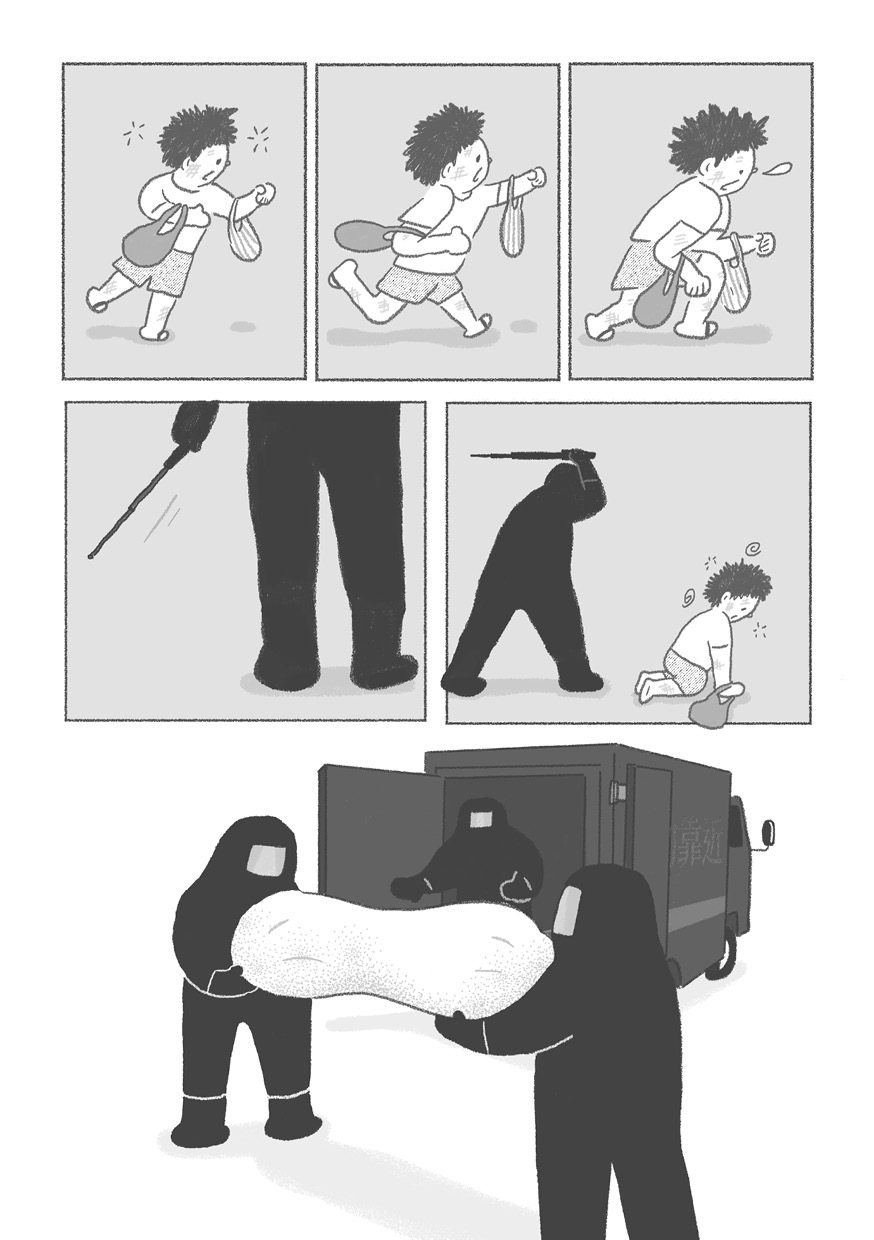
Climbing to the sixth floor we enter “I Had a Good Dream Tonight”, a world of black lines and shades of gray, visually reminiscent of a classic black and white movie. Only the main character’s lustrous head of black hair stands out from the dull gray background tones. In the spirit of realist cinema, we follow her through the routines of the day. Only after we see her taking medications and using the men’s restroom do we realize she is a trans woman in the process of transitioning. While many images of trans women in the media are of hyper-sexualized drag queens, focusing on glamour, makeup, and fashion, “I Had a Good Dream Tonight” is an honest and unadorned portrait touched by a dull anguish that even the advances of 2024 cannot completely erase.
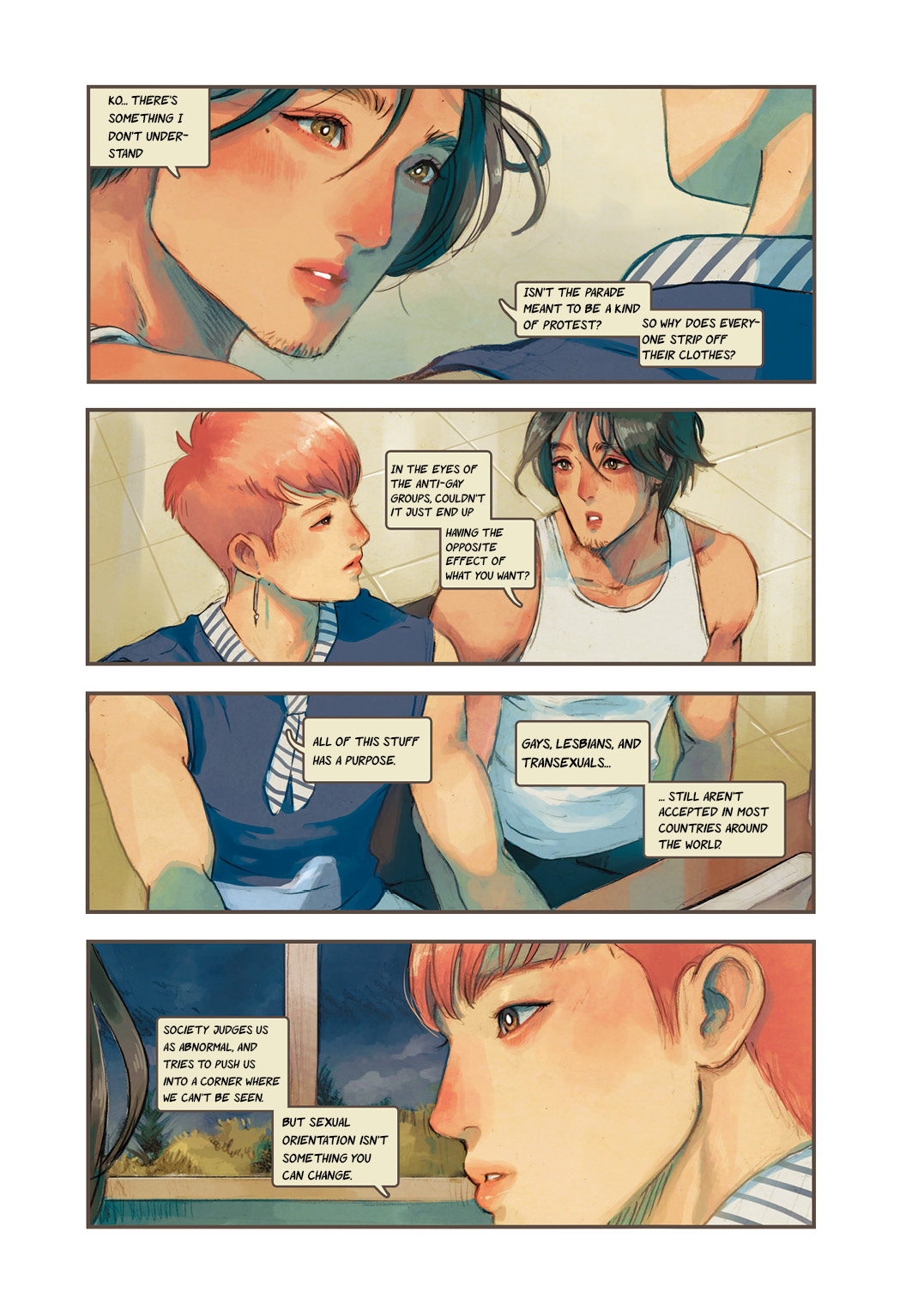
Finally, we arrive on the seventh floor, the highest floor of the building. In Taiwan, the top floors of buildings are often cheaply constructed additions that can be rented at lower cost. Thus, they are often inhabited by students on a budget. Here, with the story “Darling Knight”, we are greeted by full-color images in vigorous, youthful tones. The story is set within the milieu of gay youth culture: workouts at the gym, part-time jobs, pride parades, classes, and social media. Two roommates nurse a budding attraction for each other through good-natured teasing, horsing around, and daily life interactions. Drawn with a touch of prototypical comic book flair, this is a story about dawning self-knowledge and the need to live as one truly is. Throw in a few references to boys love comics, fetishization of the male body, and some humor in the form of a boys-love-obsessed ex-girlfriend, and you have all of the elements needed for a dependable, bread-and-butter LGBTQ comic.
The climb from the first floor to the seventh has taken us on a journey through this many-hued structure of images from the near future, delivering an introspective and thoughtful take on the LGBTQ community in contemporary Taiwan. Media representations of LGBTQ culture have evolved over multiple decades of recent history. While works of literature, theater, film, and television all speak to the creative energy of the community, comic books are perhaps one of the freshest, most enjoyable, and most effective mediums at its disposal. The six comics collected here can be appreciated on the basis of their stories, art, and the issues each addresses. But taken as a whole, this collection’s most affecting attribute is its pervasive sense of familiarity and intimacy. The LGBTQ comics of the past have been sexy, funny, dramatic, satirical… but Rainbow Apartment is probably the first complete LGBTQ comic compilation, and the first that does so much to help normalize LGBTQ lifestyles.
There are so many comic books in this world, but that doesn’t mean they are easy to create. Just thinking about all of the labor and effort required is enough to make one tired. Let us all appreciate the work that went into this magnificent collection, while also looking forward to the work of the future comic creators who will keep telling these important stories. May their beautiful words and images continue to put the pride and dignity of the LBGTQ community on display.